Premier League
Company
OstModern
Role
Design Lead
Deliverables
Apps, Vision
Designing digital platforms to bring the Premier League closer to fans worldwide.
The Challange
The Premier League needed to modernise its digital presence to serve a global fanbase. Existing platforms focused too heavily on match schedules and scores, with little attention to storytelling, stats, and personalisation. Fans wanted a richer, always-on experience.
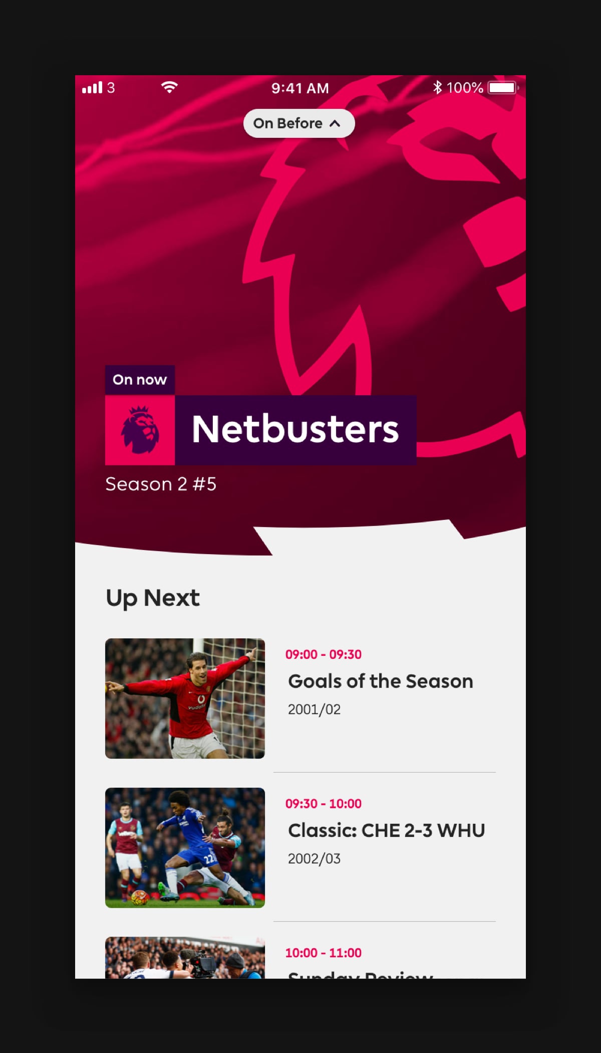
Our objective was to make the homepage a key destination for content discovery. With catchy editorial titles and curated sections which show the depth of content as well as injecting some sassy brand personality.
The Approach
Conducted competitor analysis of top global sports platforms
Interviewed fans in multiple markets to understand how they follow the league
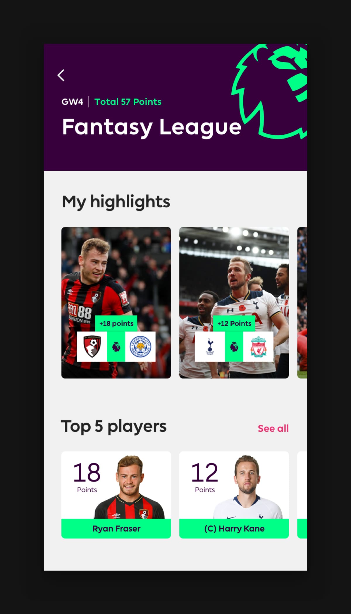
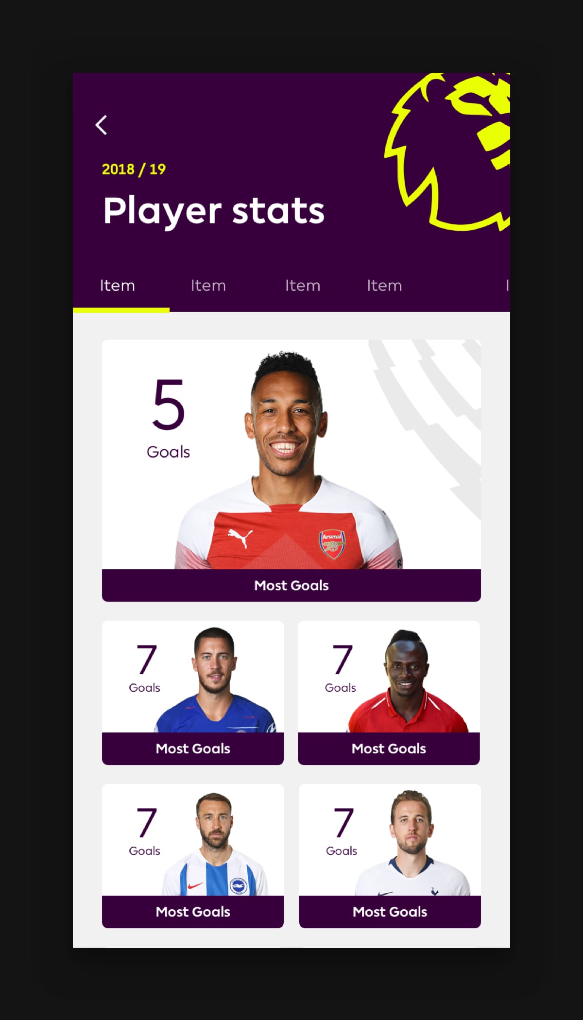
Created prototypes for new stats, highlights, and personalised news feeds
Worked closely with data providers to design clean visualisations for live match stats
The Solution
Redesigned the digital ecosystem with mobile-first thinking.
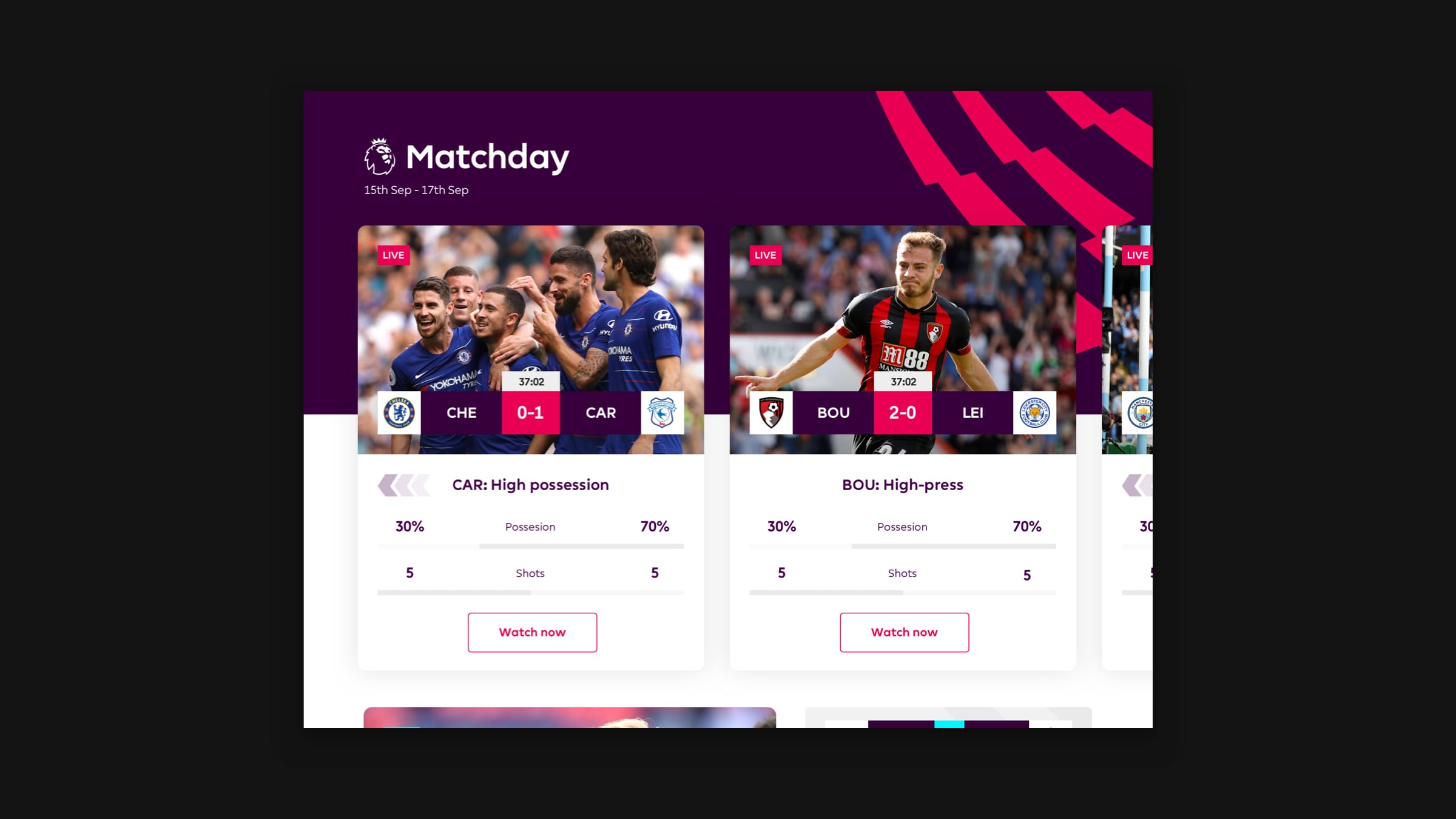
Built dynamic match centres featuring live stats, commentary, and highlights
Introduced personalisation: follow your club, get tailored content and notifications
Designed a scalable UI system to work across web, mobile, and partner platforms
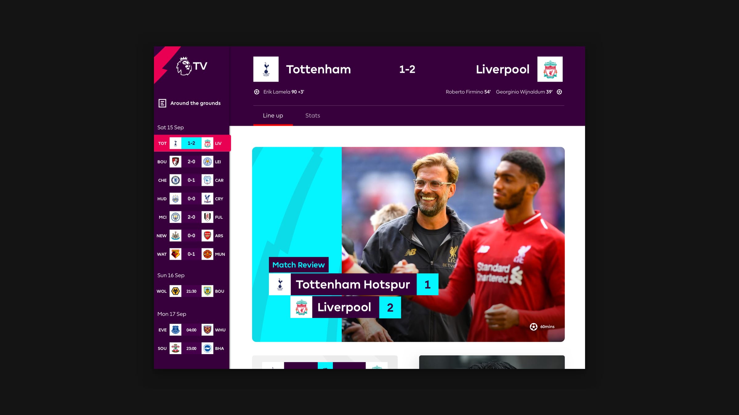
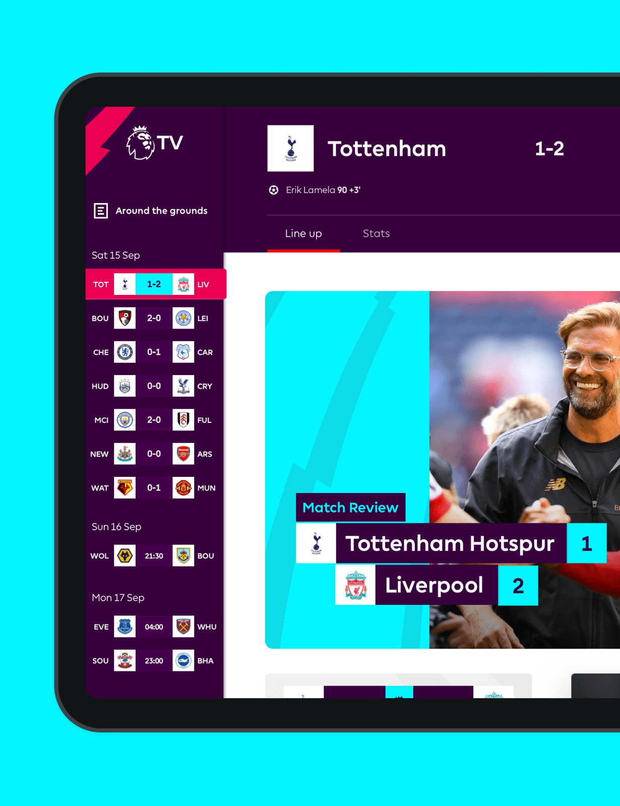
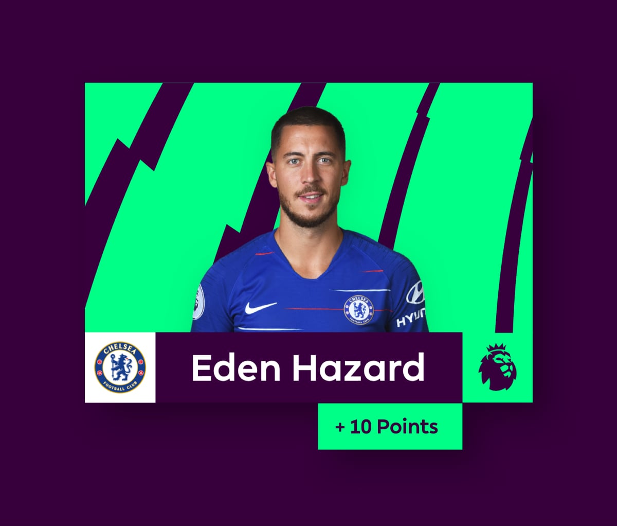
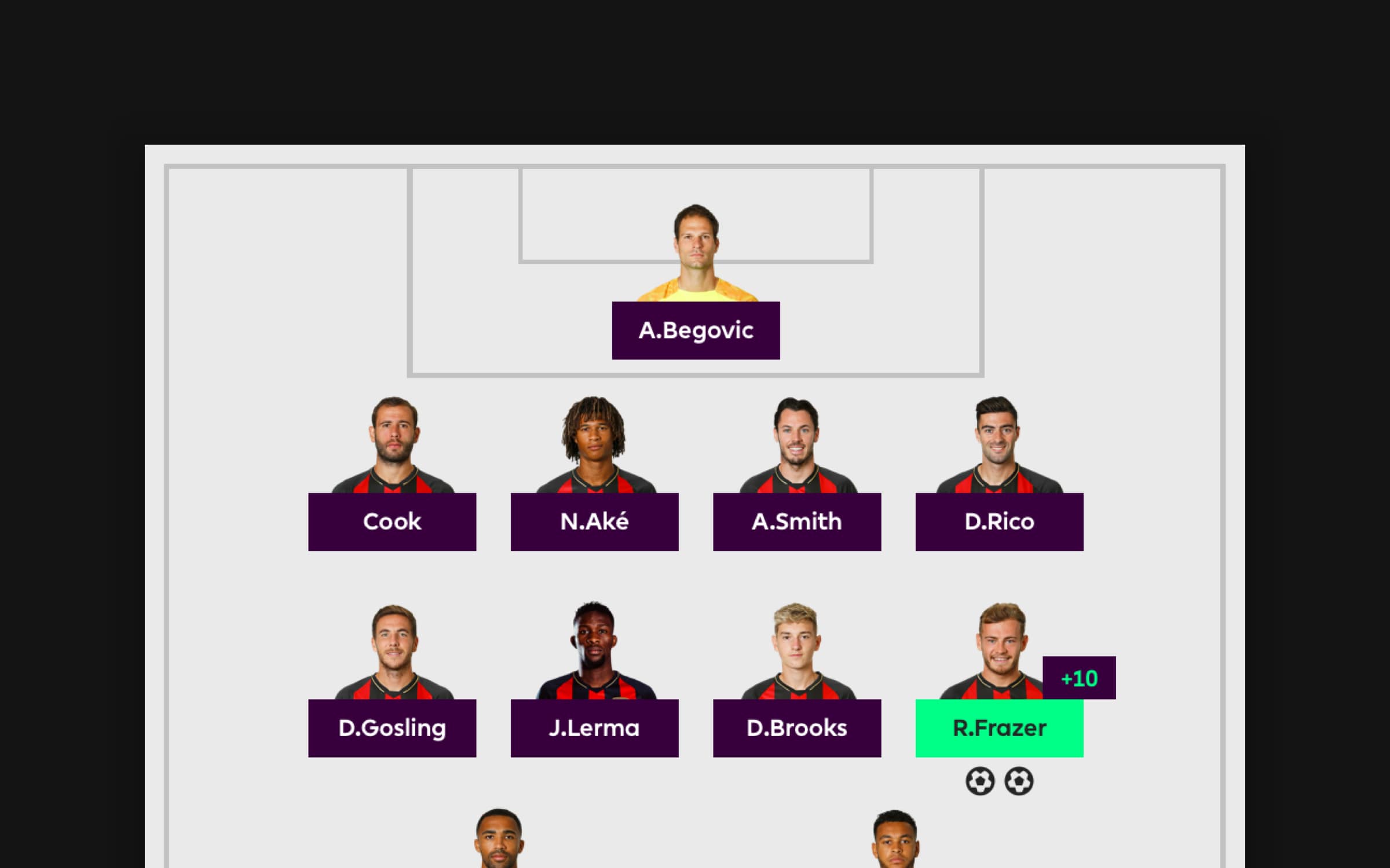
To explain the Match Day concept we built a high fidelity prototype that allowed potential investors and partners to demo a typical match day weekend. We allowed them to simultaneously switch between any live match, look at team line up stats and receive real-time Fantasy Football notifications.
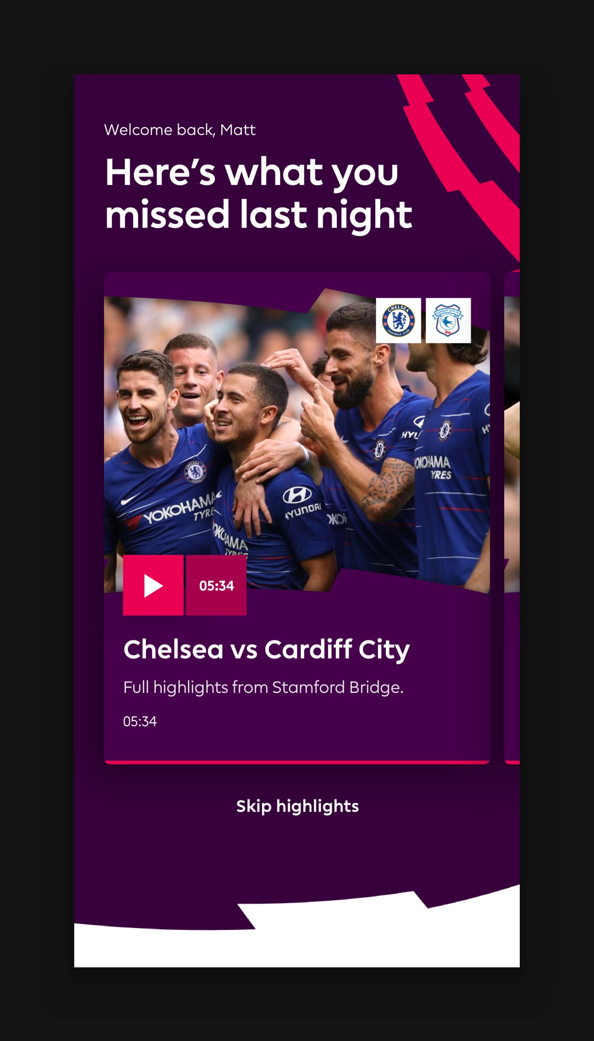
As most Singapore fans are not able to watch the live game we created a ‘since you’ve been gone’ concept which packaged up all of the action from the weekend into digestible VOD content. Catch up on your favourite team news, watch goals and highlights from other games, and check up on Fantasy Football results.
Brand application
Unique brand, bold application
hayu has a unique brand that separates it from other streaming services. It was important to capture this across Web, iOS and Android devices in a considered approach, ensuring native patterns were used correctly without compromising the design.
We worked closely with a development team producing a lean design system and guidelines to ensure the product was built smartly and efficiently.
Impact
25%
Improved discovery
Back to top
